Dr. CSS Box or: How I Learned to Stop Worrying and Love the Margin
The CSS box model is simple, right?

The CSS box model is simple, right? You just imagine your content as a box, and that box has interior padding, and outside of the box, you use margin to control its position relative to elements around it. It's so simple, it requires no real conversation to make sure we all have the same understanding of what exactly all of these things (content, layout, etc) really means.
That's the problem. Where does my box start, and where does it end? When do I need margin, and when do I need padding? What is the airspeed velocity of an unladen swallow? These are the questions that keep web developers up at night, and these are the questions that I, the highest authority on web development in the world, am here to answer.
THE AFOREMENTIONED BOX:

The idea is simple:
- padding positions the content inside the box
- margin positions the box relative to other elements
The problem comes when working with padding and margin in conjunction. Let's say you have <div> elements with 2 <p> elements inside of them. Our design calls for us to position the content inside of these 2 boxes 32 pixels apart.
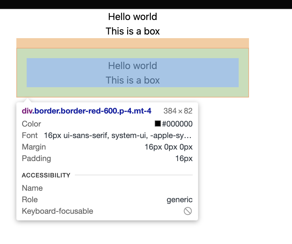
I'm putting a red border around the second box so you can get an idea of where it begins and ends, but let's just imagine that in the real design, there is no border.
I have added 16 pixels of vertical padding in our second box, and a margin of 16 pixels to the top. Now I have a box with margin, padding, and content! I can inspect the element in my devtools and see that with my padding and margin combined, I have all 32 pixels accounted for:
Do we really need vertical padding if there is no background or border on your box?
Vertical padding, when it's not absolutely necessary, makes understanding the real pixel distance between your elements much harder to understand.
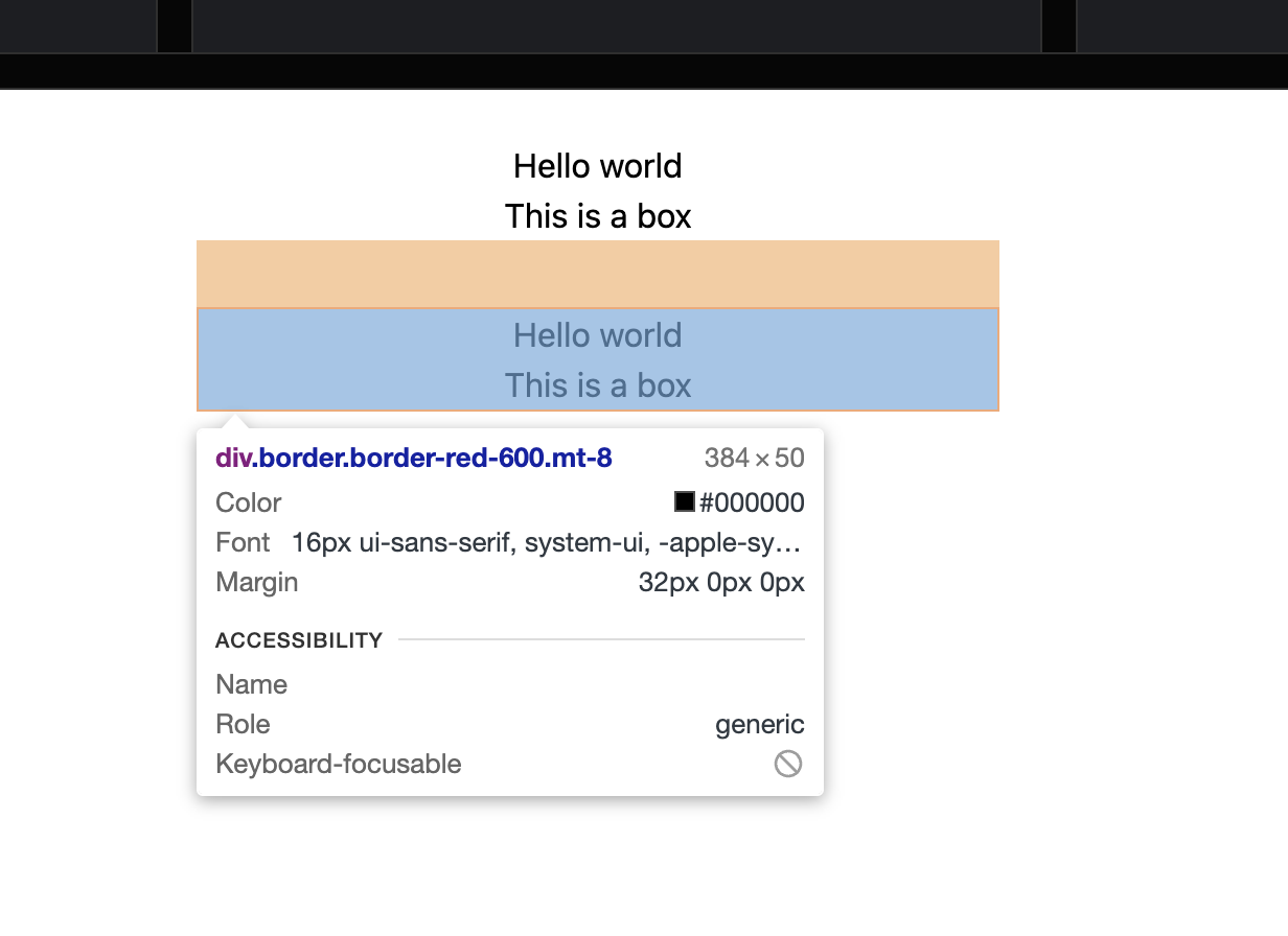
Since the only stipulation of our design is that our content (text) needs to be vertically separated by 32 pixels, I propose that we don't include any vertical padding on our second element, and that we instead add all 32 pixels as top-margin to our bottom box.
You can visualize that change here, with the red border as an indication of the box itself:
Now, when we inspect that element with our devtools, we can easily see the distance between content, as it is all in one margin rule:
But when do I use vertical margin then?
You can use vertical margin anytime your element has a background or a border!
If our design calls for more than just raw text content, and our element has a background, we should absolutely use vertical padding! Backgrounds and borders create a clear distinction between padding and margin.
In the example below, I still have 2 div elements with 2 internal <p> elements inside of each, but the div elements now have their own backgrounds.
The new stipulations of our design are:
- we need two boxes with 2 lines of text in each
- one box has a black background, and one box has a blue background
- we have 16 pixels of the background above and below the text in each box
- we have 16 pixels between the boxes
TL/DR
Don't use vertical padding on an element unless you need to position your content appropriately in relation to that element's border or a background


